
hej,
My name is Ragnar Gulin. I'm a UX designer and frontend developer with a background in psychology. I create intuitive, visually polished, and behavior-driven digital experiences built with clean code.
After many years in higher education — spanning psychology, UX, and frontend development — I’ve become a one-stop shop for most things digital. I’ve designed and built websites, apps, games, and software across several different sectors.
As a designer, I focus on clean, logical interfaces and inclusive, accessible design with thoughtful functionality — drawing on my background in psychology to craft meaningful, behavior-driven experiences.
When I’m not designing, you’ll probably find me exploring one of my many creative outlets, such as woodworking, drawing, photography, or, most recently, tattooing.
work.
01. SHARE by Volvo
methods
- Brainstorming
- Figma prototyping
- Environmental work
- Sustainability aspects
- Storyboard
- Desktop research
deliverables
- User journey of current state
- A brand new concept: Share by Volvo
- Research on financial impact of the solution, both for project owner and customers
- Wireframes and prototype, to be used as a base of discussion for further development
- A presentation of the final design for stakeholders at Volvo
background
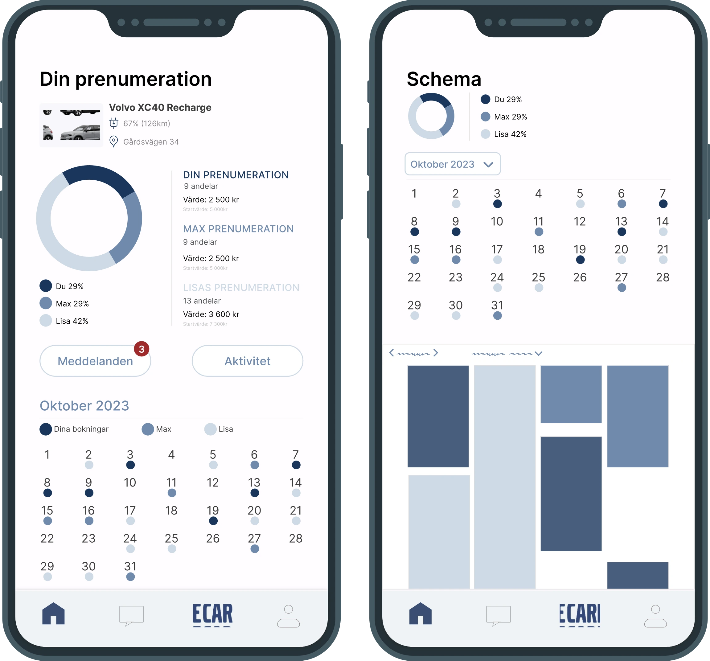
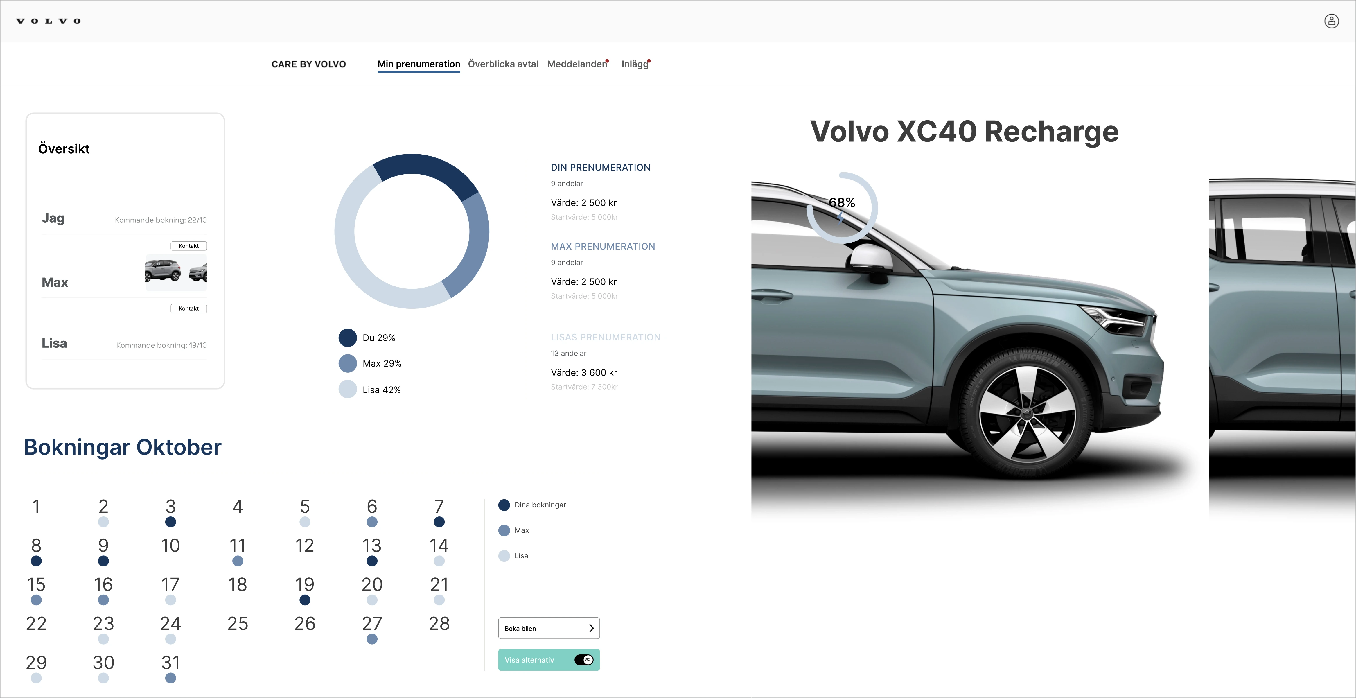
The automobile industry is currently going through large changes in relation to sustainable production, moving from selling products to selling a service, and changing views of ownership. Our mission was to examine ways in which Volvo could work with these changes and develop a service that aligns with Volvos values and provides a service that is environmentally, socially and economicaly sustainable. Our work led to a completely new concept, called Share by Volvo. This shared-subscription model solves several issues related to automobile ownership, enabling users to only subscribe to a car as much or little as they need to.
As one of five UX Designers and UX Researchers, I was responsible for conducting brainstorming sessions, creating prototypes in Figma, integrating environmental and sustainability considerations, developing storyboards, and performing desktop research. My focus was on ensuring the design aligned with Volvo’s values and addressed the needs of future users.
who will use the service?
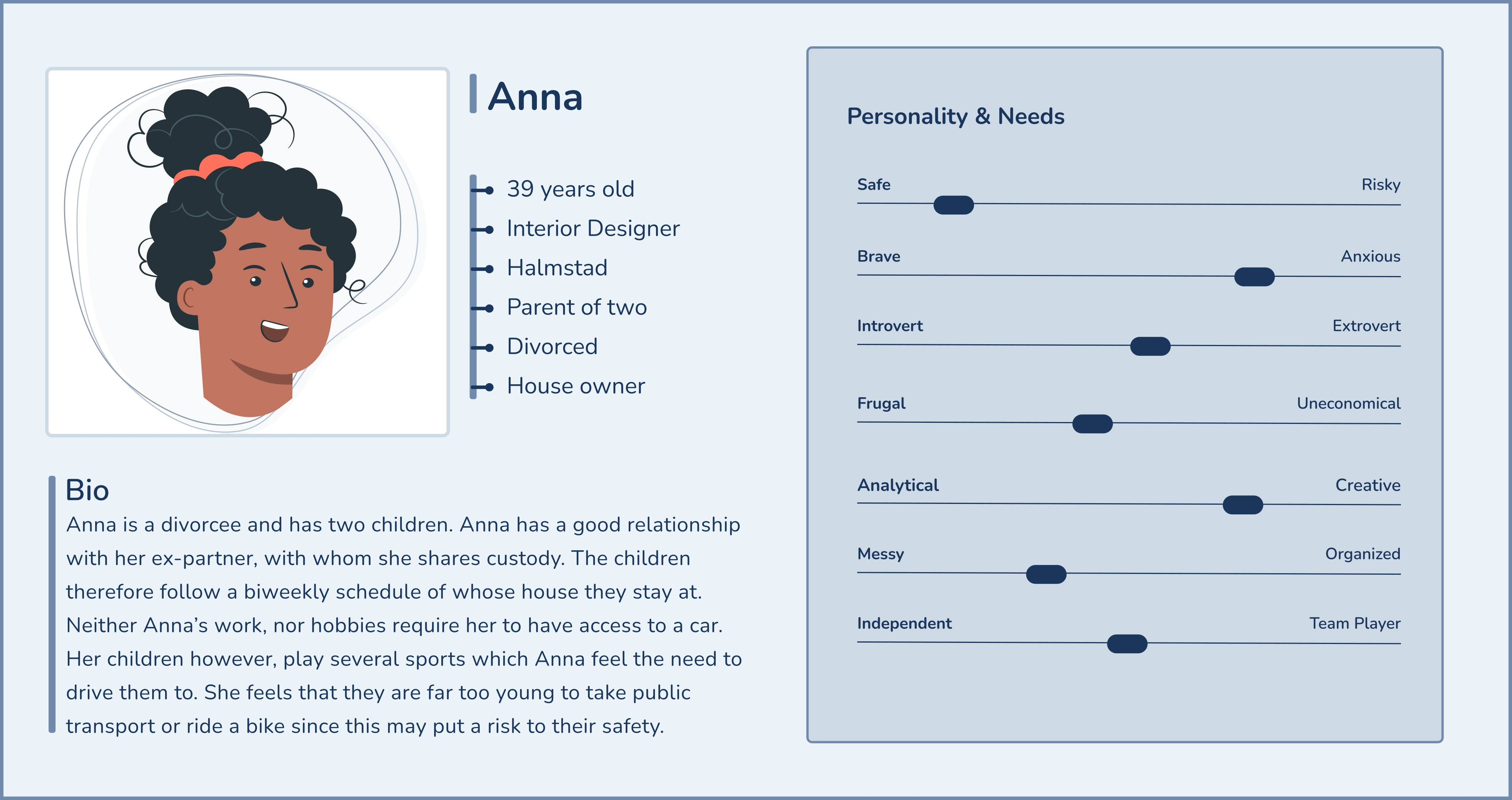
Anna, our persona from the (near) future, was created early on in the project to guide future decisions and ensure we always kept our main stakeholder in mind. Anna is a representation of many different Volvo users, fused together into one dynamic person. She is the result of both our own user research and Volvo's user data. Anna is also designed to describe the needs of users in the near future, in modern societies.
The service will be used by people who don’t need a car every day, but whose lives could be made easier by having one sometimes. Single-parent households, students, flex-workers, and people living in urban environments close to work are some of our primary stakeholders, as their needs fit well into a sharing economy.
what will the future look like?
Before developing the service, we chose to focus on imagining what societies might look like in the near future. This would help us figure out how car ownership might fit into this reality. Anticipating an increase in remote work, we foresee a shift in the way people live and work. The trend of urban migration also suggests a higher concentration of people living in close proximity. Additionally, despite the initial higher cost, we expect electric cars to become more prevalent.
In light of these factors, questions arise about traditional car ownership. Does everyone truly need full-time access to a personal car? What if the cost of individual ownership is prohibitive? Could neighbours share a car? With these considerations in mind, our focus turned towards creating a platform where people can manage ownership, participate in the sharing economy, and book cars as needed. Such a platform has the potential to save time and money, reduce the need for extensive parking infrastructure, and contribute to environmental well-being.
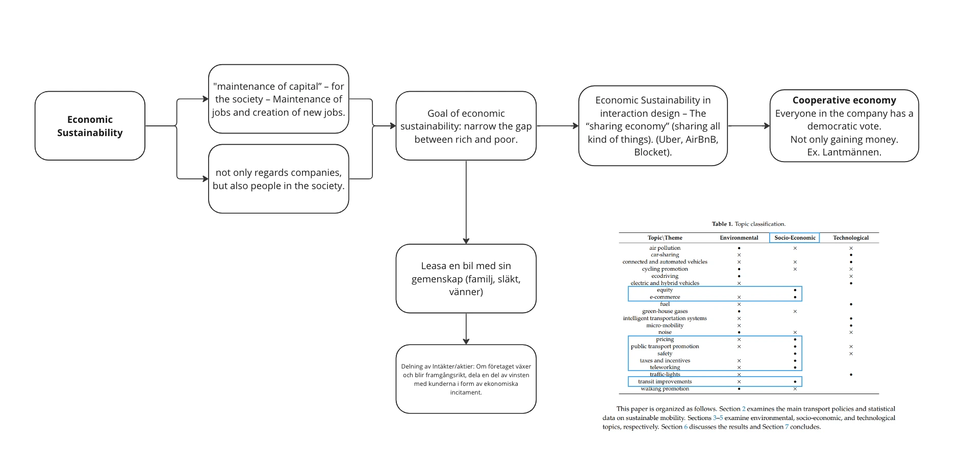
economic sustainability
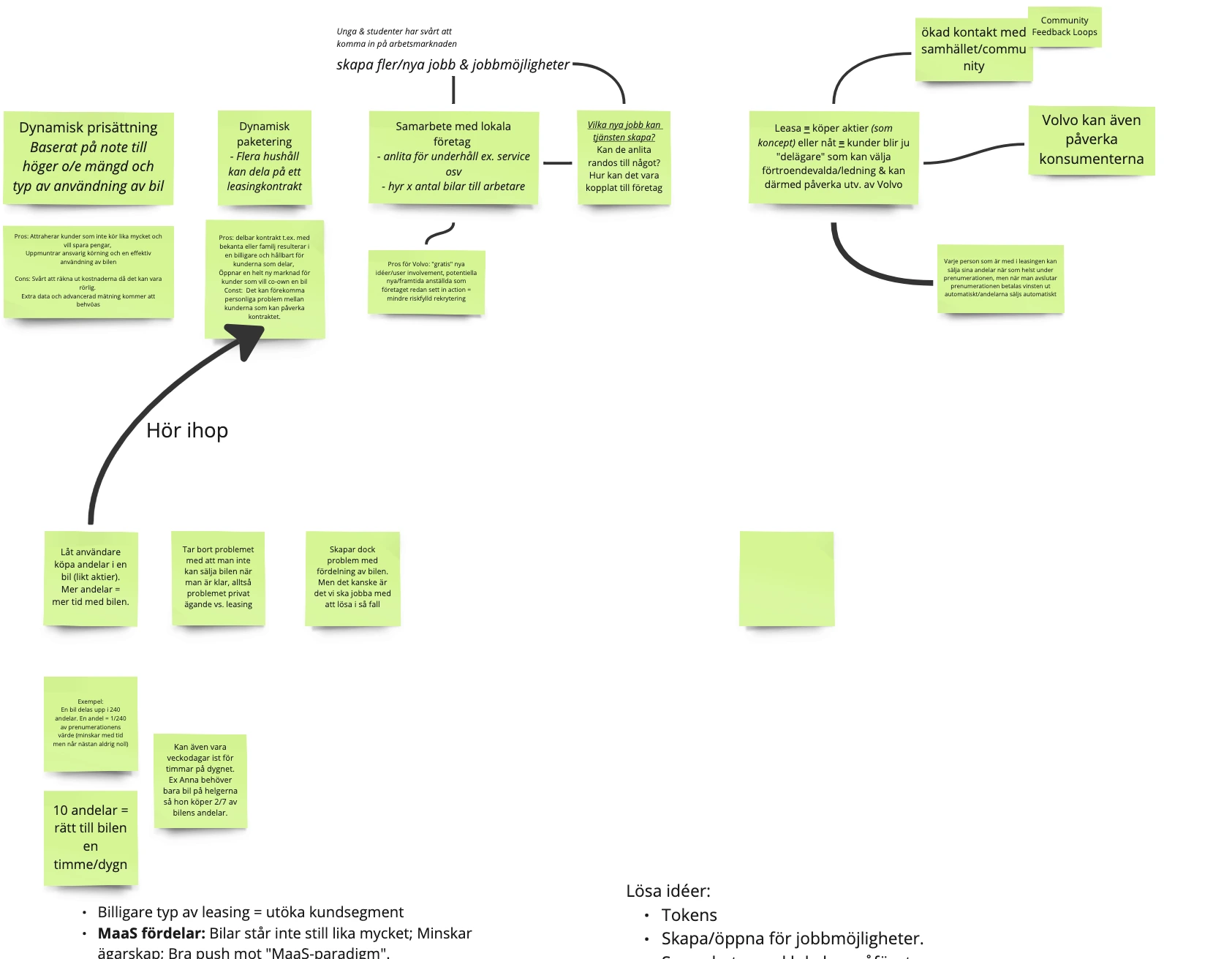
Through desktop research on economic sustainability and the sharing economy, we developed a subscription model based on usage. The idea was that if you only needed a car once a week, you shouldn’t have to pay for the other six days. This concept became the foundation for "Share by Volvo." Our final design introduced a flexible subscription model where users could purchase shares of a car based on their needs. For instance, a parent who requires a car only 50% of the time could subscribe accordingly, sharing ownership and paying proportionately less.
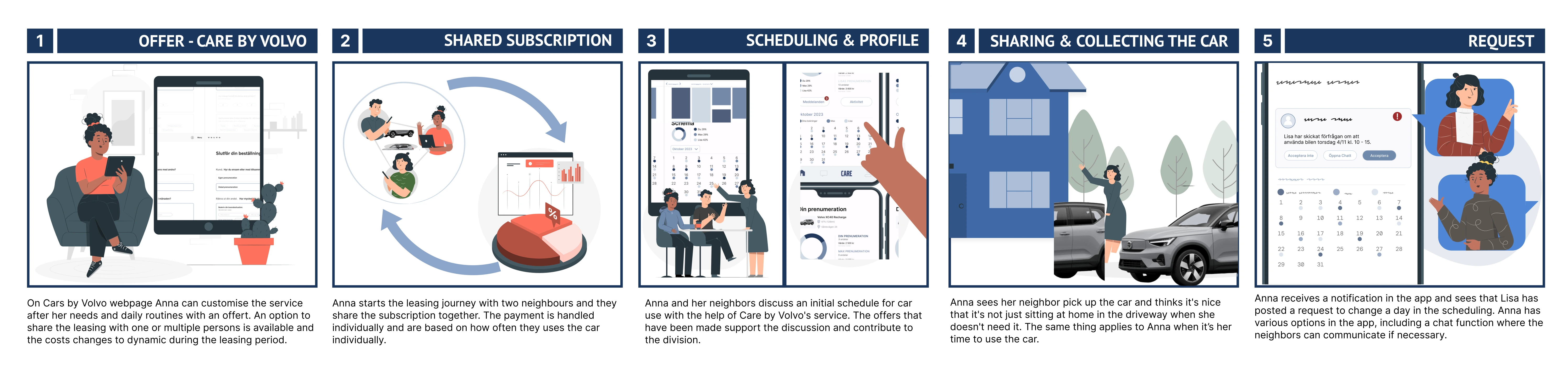
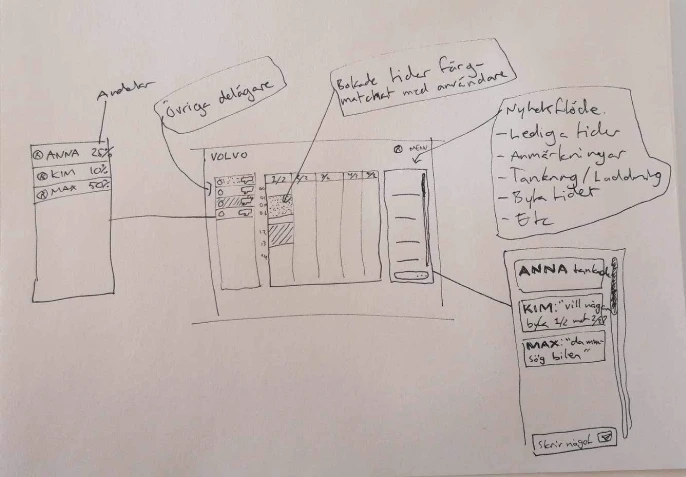
storyboarding
To illustrate user interaction with the service, we created a storyboard. This approach was used to demonstrate how the service could function in future scenarios, using conceptual visualization over a finished product. The storyboard depicted a user scenario of our persona Anna, sharing a car with neighbors.
final design
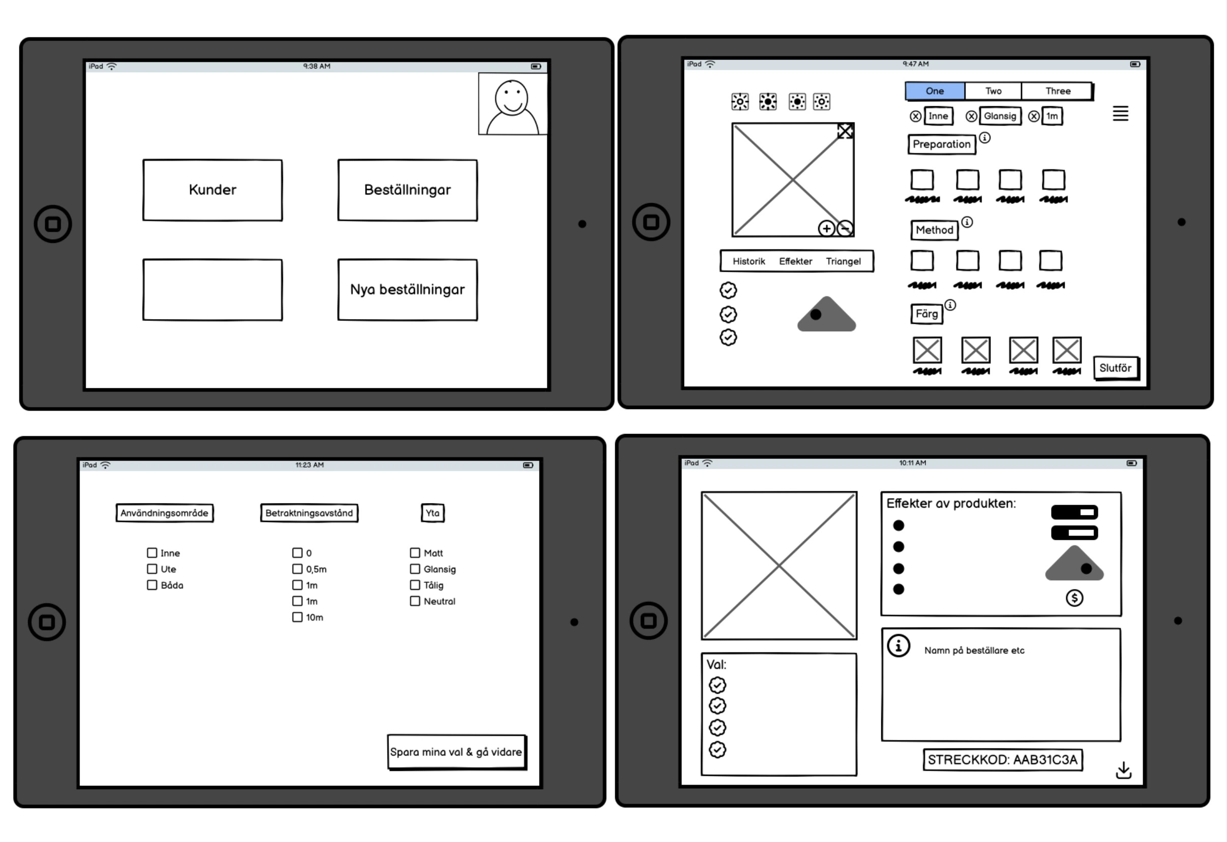
We created wireframes and prototypes in Figma to visualize how the service would work. These prototypes included user interfaces for the subscription platform and mobile application, showcasing features such as subscription management, communication tools for co-owners, and scheduling capabilities. The prototypes were designed to be user-friendly and intuitive, focusing on ease of use and accessibility.
The Share the Care model presents a thoughtful solution that addresses economic, social, and environmental sustainability. By combining innovative subscription models, user-friendly interfaces, and an emphasis on community building, this project offers a holistic approach to redefining future car subscriptions toward a more sustainable direction. To illustrate the concept, a storyboard, a report and mixed fidelity wireframes were delivered.
We also recognized the potential to expand the customer reach by introducing a flexible, shareable subscription model. The traditional car subscription model often caters to individuals with higher incomes, but by making car access more inclusive and economically viable for a broader audience, including those with irregular or lower incomes, we aimed to broaden the appeal of the service.
We also addressed the varied needs of different user groups. Recognizing that not everyone requires constant access to a car, our design allows for partial subscriptions. For instance, parents with shared custody or individuals who work remotely can subscribe to a car only when needed, reducing costs and optimizing resource use.
takeaways
One insight gained from this project is the importance of imposing creative limitations to facilitate a more efficient generation of ideas. Given Volvo's robust brand presence, clearly defined values, target audience, and established graphic profile, we had a well-defined scope to operate within. In many projects, it can be challenging to determine where to commence or which direction to explore when faced with numerous options. Employing a set of rules proved to be an effective method for concentrating on what can and should be accomplished. Additionally, this project served as a valuable exercise in creativity, as we aimed to conceptualize an entirely new idea within the established scope rather than merely enhancing an existing concept.
02. National Park Service
methods
- Desktop-research
- Think-aloud test
- Flow chart
- Wireframing
- UI-design
- High fidelity prototyping
deliverables
- Graphic manual
- Flowchart
- Persona
- Interactive, high-fidelity figma-prototype
- A presentation of the final design
background
The National Park Service is a federal agency that manages the national parks of the USA. As part of
their efforts to enable millions of people to enjoy the natural beauty of the American landscape, they
have developed an app to help users find information about anything related to different parks. The
problem is that the application, in its current form, provides too much information at a time. This
makes the app hard to navigate, which leads to frustration and makes the national parks seem less
accessible. Our goal was to identify user goals, painpoints, and redesign the app to better suit these
purposes.
As a UX Designer and UI Designer, I worked closely with another designer to conduct user research,
create wireframes, prototype designs, and oversee user testing.
desktop research
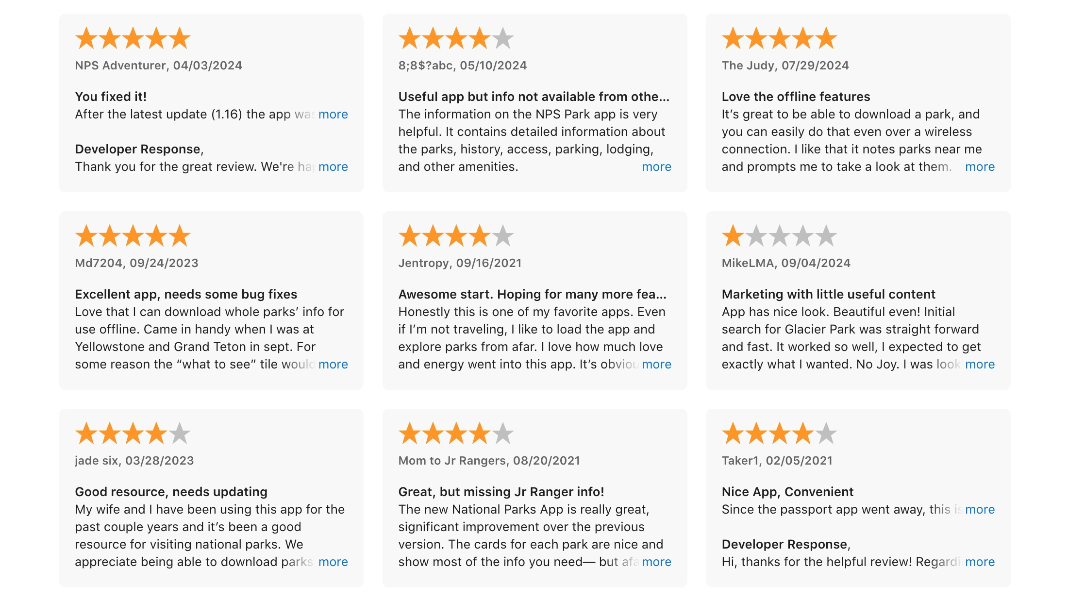
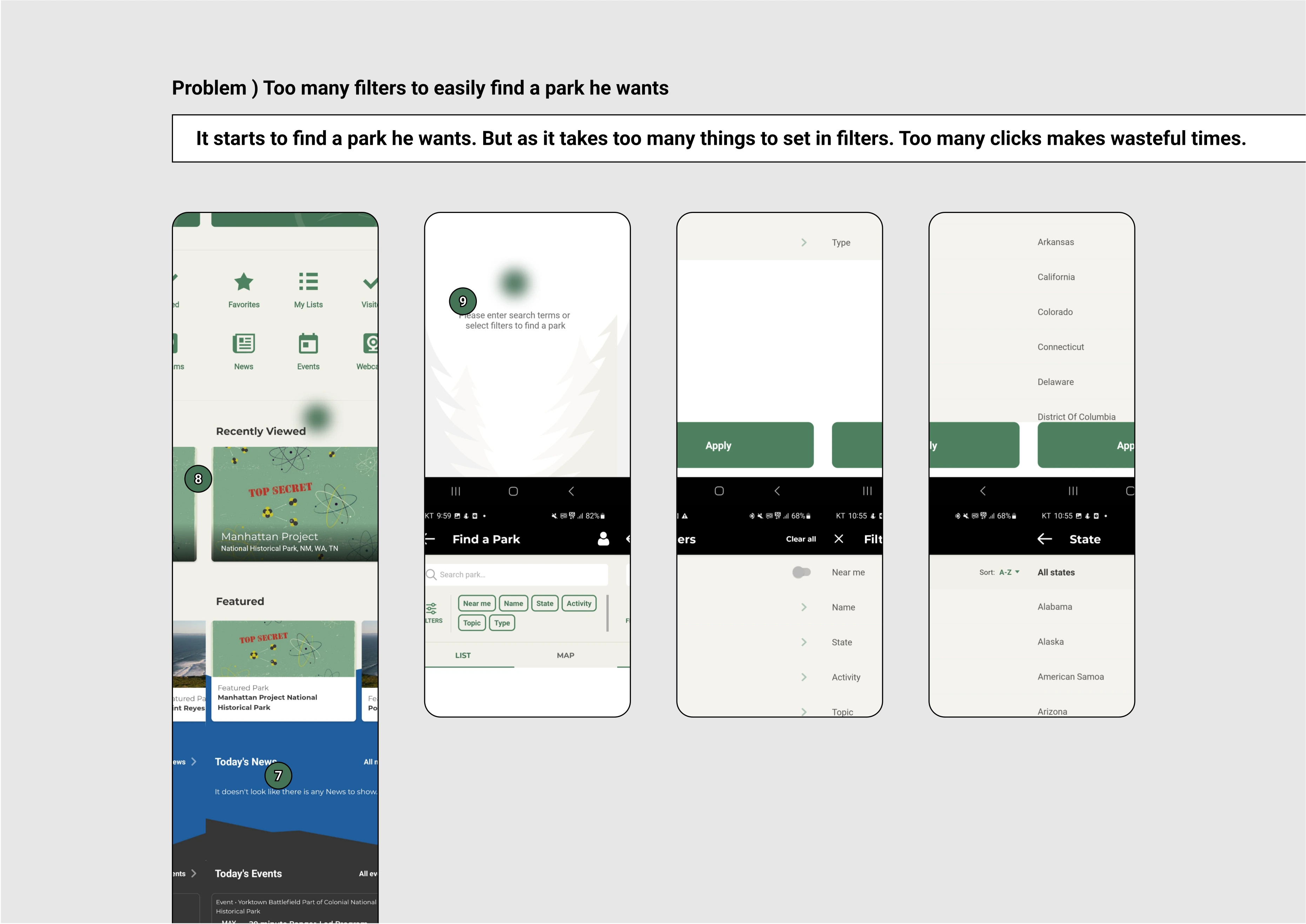
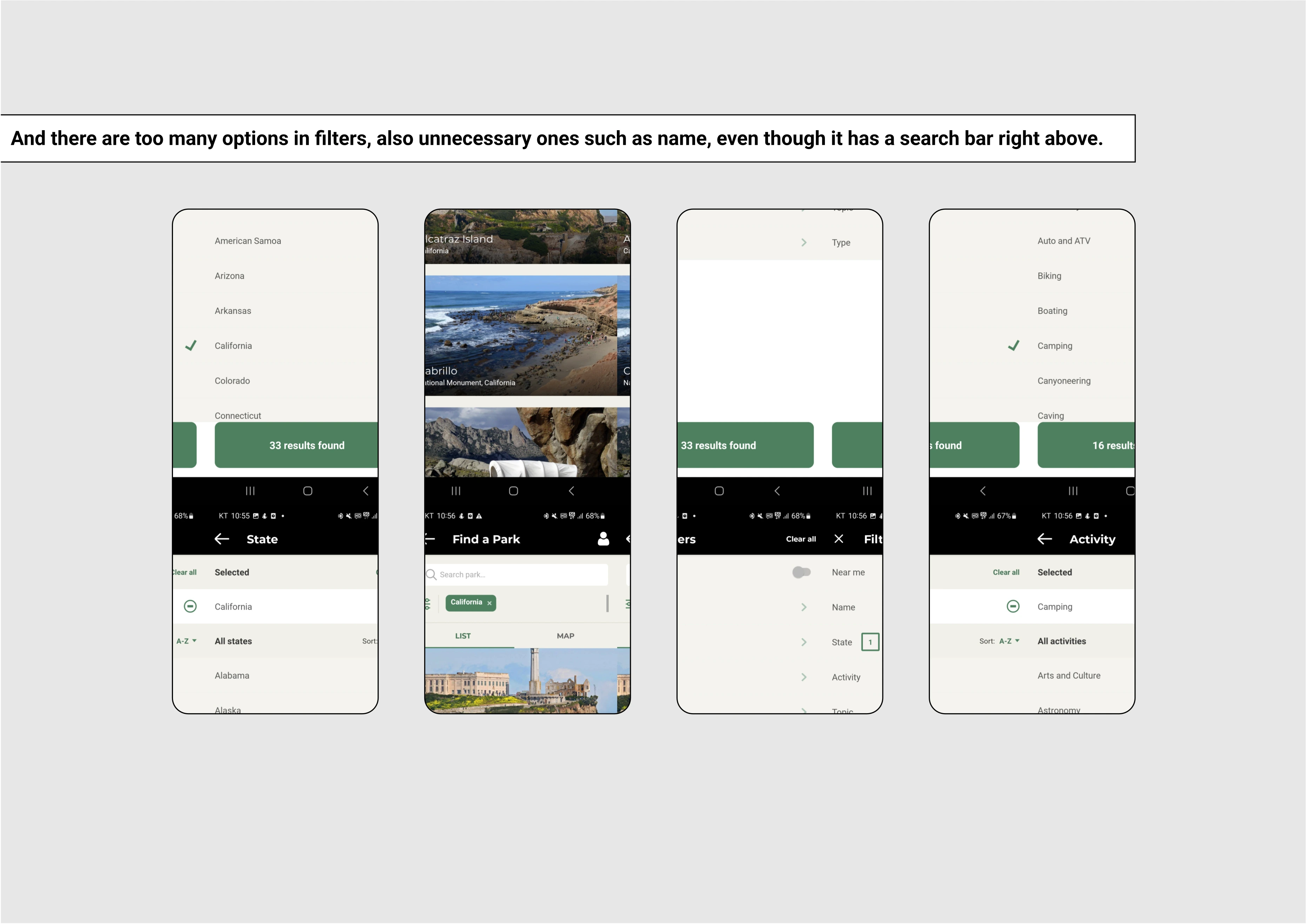
We began by conducting desktop research and studying user feedback from app reviews. The core issues identified were:
- Confusing navigation
- Inefficient filter system
- Overloaded landing page
- Poor mobile experience
think-aloud testing
Think-aloud tests was used to evaluate the design both before and after our intervention. We provided
participants with a list of tasks to complete (find a specific park, find accommodation, etc.) while
speaking out loud about their thought process. To keep distractions to a minimum, participants were
encouraged to provide their feedback in whatever language they felt most comfortable using. All
participant chose to think aloud in korean, which my partner then translated for me, enabling us both
to ask follow-up questions.
The think-aloud tests done before our intervention provided valuable insights into the usability of
the current workflow and design system and allowed us to identify areas that needed improvement. For
example, through the think-aloud tests, we were able to identify that participants had a hard time
navigating the complex filter system, which slowed down users flow and caused frustration when using
the app.
prototyping
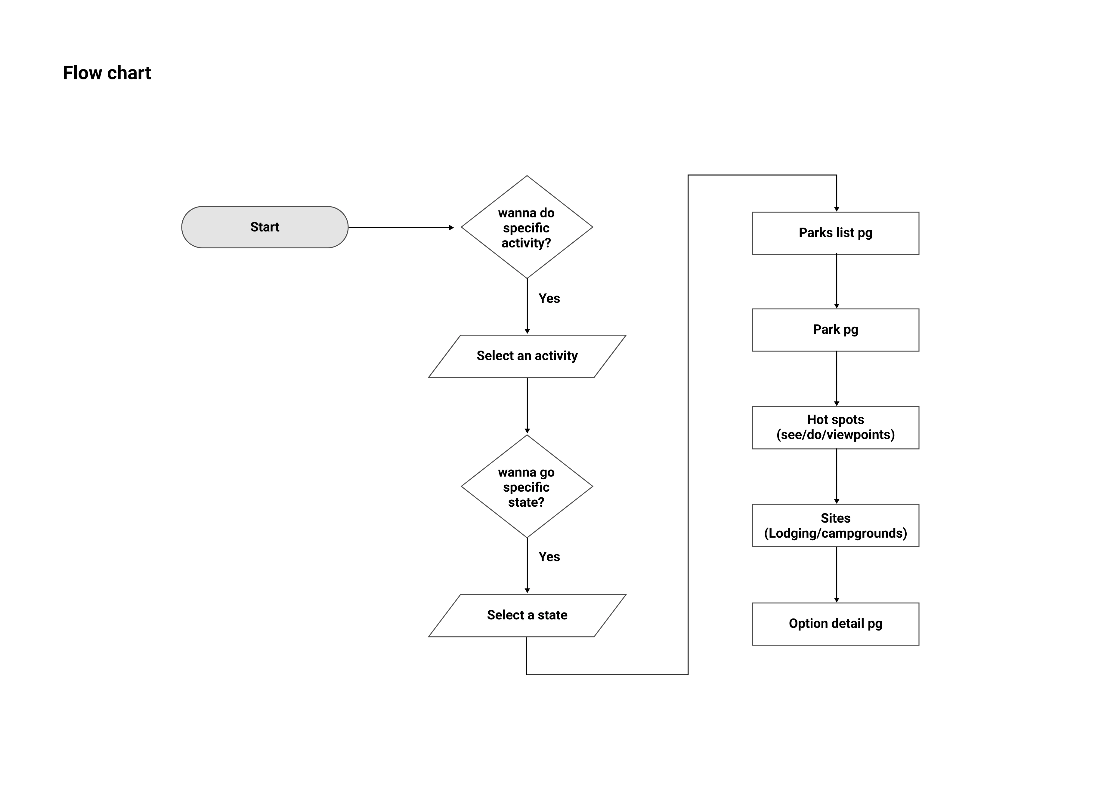
We began the process by creating a flowchart to outline a more efficient user flow. The key design improvements included:
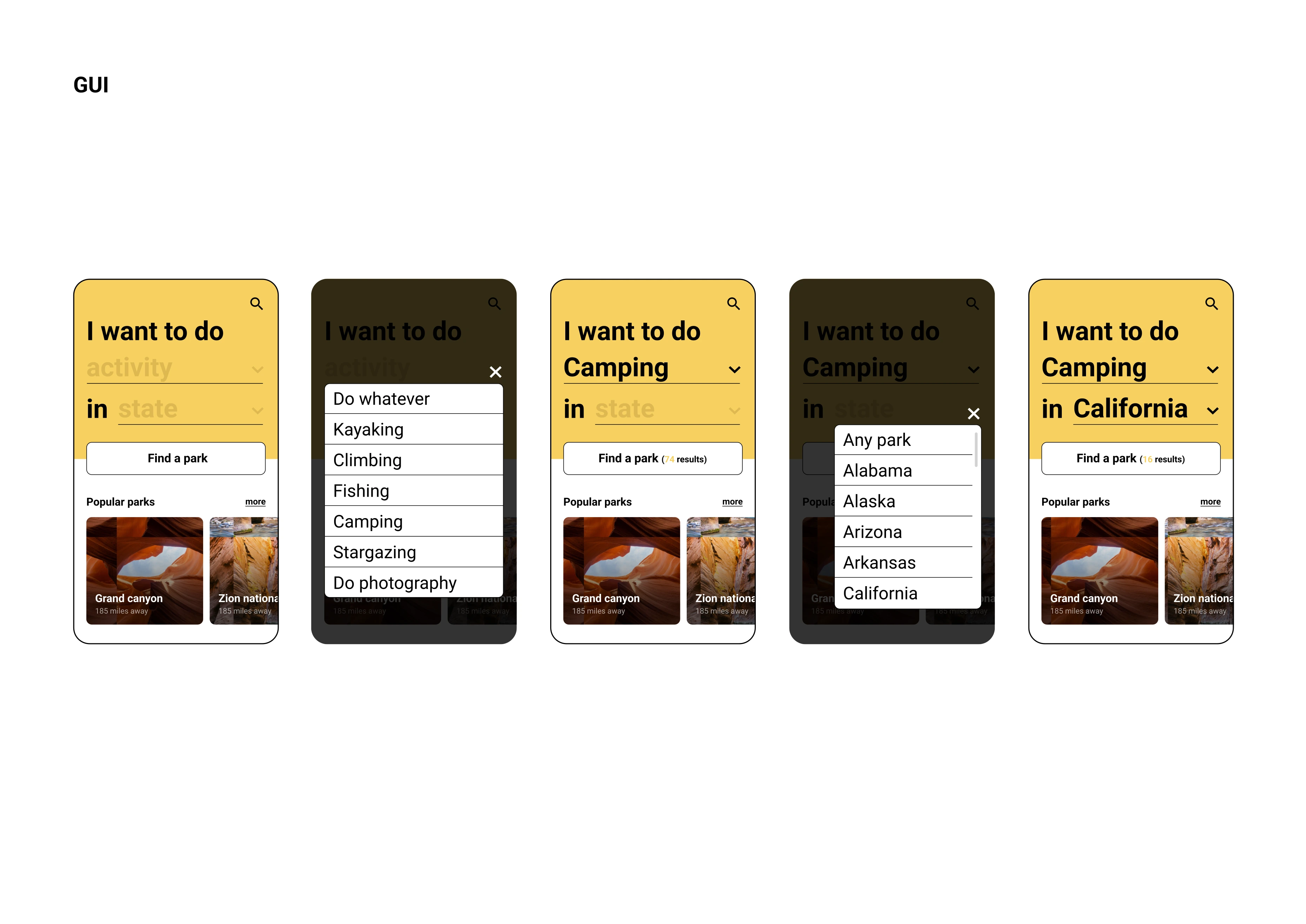
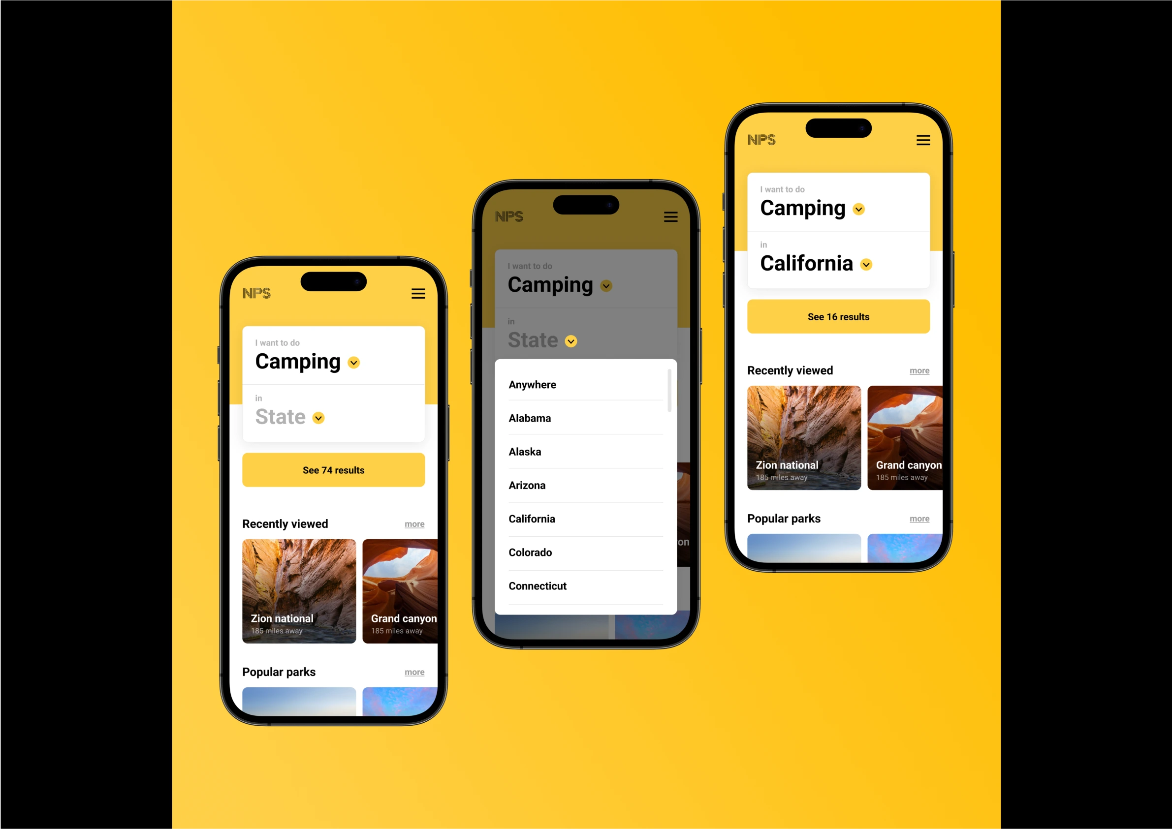
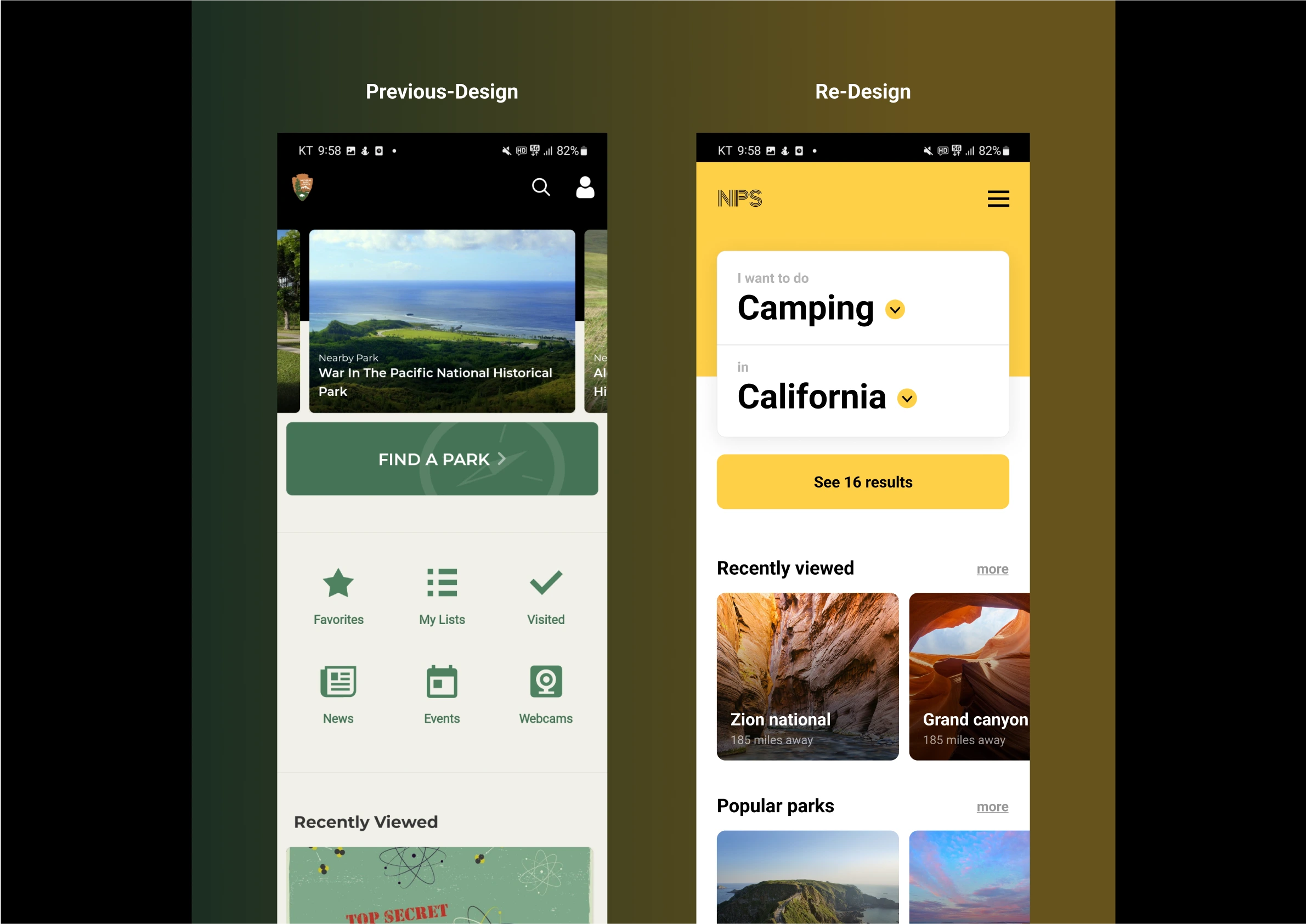
- Direct filtering on the homepage: Instead of burying filters under multiple clicks, we placed essential filters (location, activities, and services) directly on the landing page.
- Reducing cognitive load: Using Gestalt principles, we improved visual clarity by grouping related information, helping users focus on primary actions without unnecessary distractions.
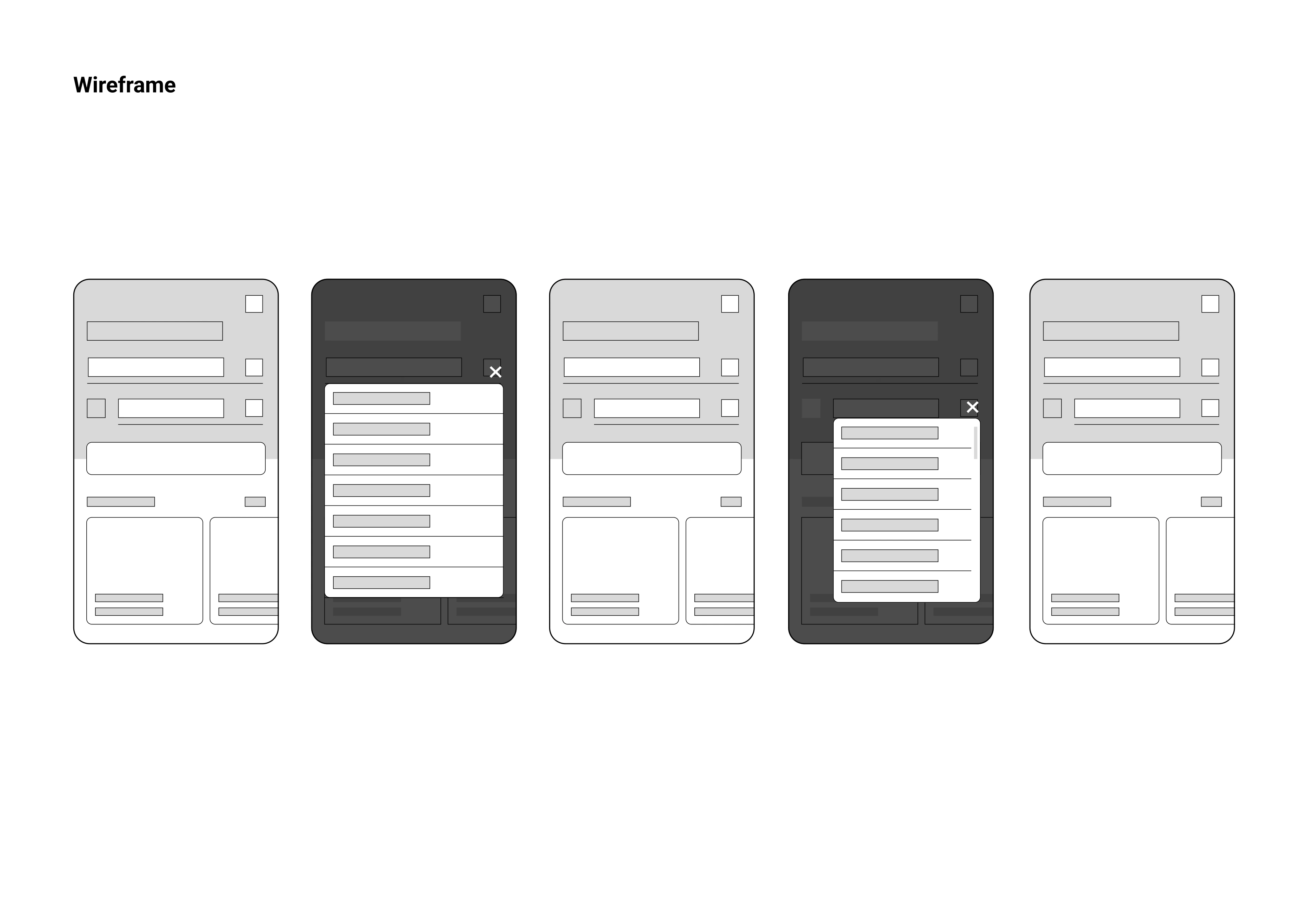
We then moved on to wireframing and prototyping:
- Wireframes & Prototyping: Starting with low-fidelity wireframes in Figma, we explored various layouts. These evolved into high-fidelity prototypes, which were refined based on feedback from both internal teams and user testing.
To ensure consistency in the design, we created a graphic manual covering key elements like colors, font sizes, margins, padding, and grids. This manual served as a reference throughout the design process. After incorporating text and images, we shared the refined design with other teams, whose feedback was helpful in fine-tuning the final product.
final design
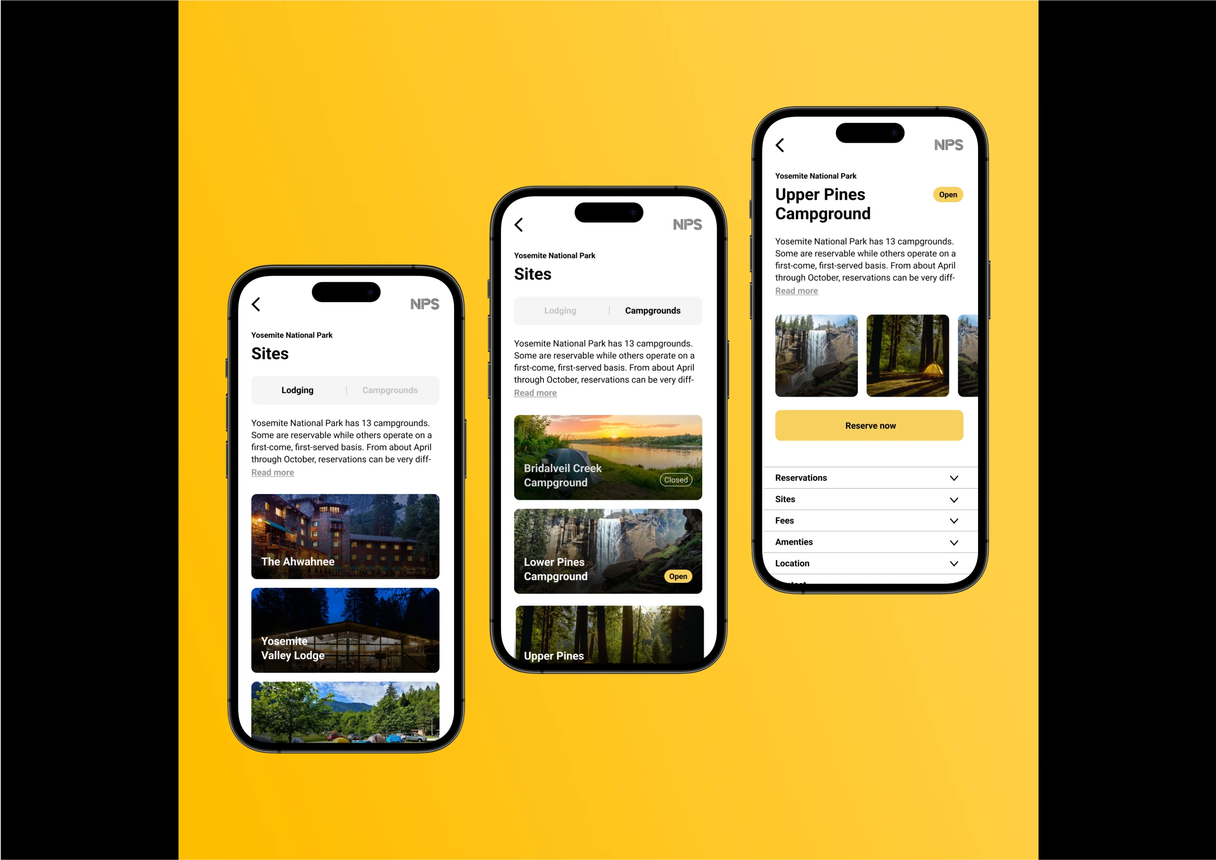
The final design significantly improved the user experience by addressing key pain points and aligning with the National Park Service's (NPS) goals of being user-friendly and efficient. The main improvements included:
- Simplifying the filter system: We removed unnecessary categories and made important filters (such as park location, activities, and accommodations) accessible directly from the homepage. This reduced the number of clicks and made it easier for users to find parks that met their criteria.
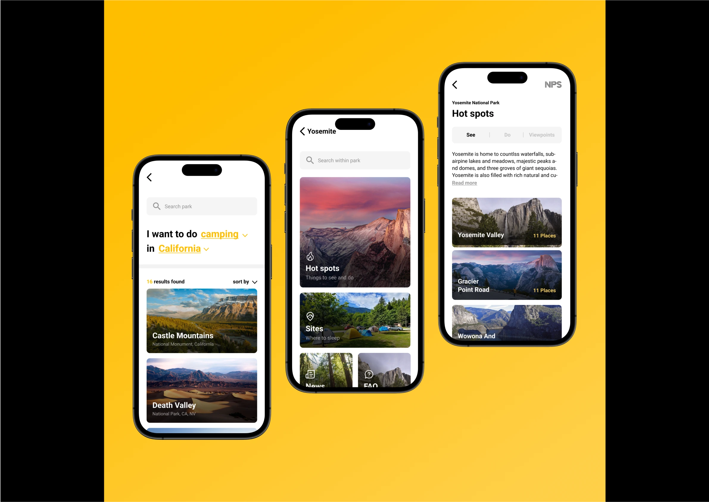
- Clear visual hierarchy: By applying Gestalt laws, we grouped related information and ensured high-priority content (e.g., park descriptions and available facilities) stood out. This minimized information overload and improved overall clarity.
- Mobile-first design: We optimized the app for mobile users, implementing a responsive design that works seamlessly on smaller screens, improving the experience for users on all devices.
These improvements not only saved users several steps in navigating the app, but also reduced cognitive load by focusing attention on the most relevant information. As a result, the app became more intuitive and aligned with the NPS's mission to make park information more accessible and easier to use.
challenges
01: Diverse User Needs
One of the main challenges was accommodating the wide range of user types, from seasoned hikers to
casual visitors. We had to strike a balance between simplifying the experience for beginners while
still offering depth for experienced users.
02: Prioritizing Content
The app had a lot of important content (park regulations, weather, trails, etc.). Deciding which
information to feature prominently required careful consideration to avoid overwhelming users.
takeaways
This project underscored the significance of clearly defining the goal of the service being designed. Initially, the NPS application appeared to be a well-functioning tool in its current form. However, upon attempting to use it for its primary intended purpose, our research revealed its shortcomings. Our redesign successfully enhanced the user experience by ensuring alignment with the intended goal. For future projects, I will make sure to have a clear understanding of the project owner's expectations and their objectives for the end user, to make sure I design something that is useful in the way it’s intended to be.
03. Aluprofil
methods
- Card sorting test
- Think-aloud test
- Semi-structured interviews with stakeholders
- Storyboard
- Personas
- Agile workflow
- Use case scenario
- 6-8-5 method
- Heuristic evaluation
- User testing
- Stakeholder mapping
deliverables
- Renewed excitement about the project among stakeholders
- Persona
- Storyboard
- User journey
- Interactive mixed-fidelity figma-prototype
- Interactive prototype coded in HTML, CSS & JS
- Graphic profile
- New insights into the problem area, drawn from stakeholder interviews
- Research as a basis for further work
- A presentation of the final design for stakeholders within the field
background
The aluminum production process is highly complex and every step of the production line can have an
effect on the final product. Sellers and buyers often encounter misunderstandings caused by different
expectations. When customers aren’t satisfied with the product they receive, they may ask for refunds,
which leads to huge costs for suppliers, and increased delivery time for buyers. There currently isn’t
a good and reliable way to communicate expectations clearly. Our mission was to find out what causes
the misunderstandings, present a conceptual model of the aluminum manufacturing process, and deliver a
prototype for an app that could be used by stakeholders.
As the lead UX designer and team leader, I was responsible for ensuring the project aligned with
deadlines, contacting stakeholders, and overseeing the design and development process, helping out
where I was needed most.
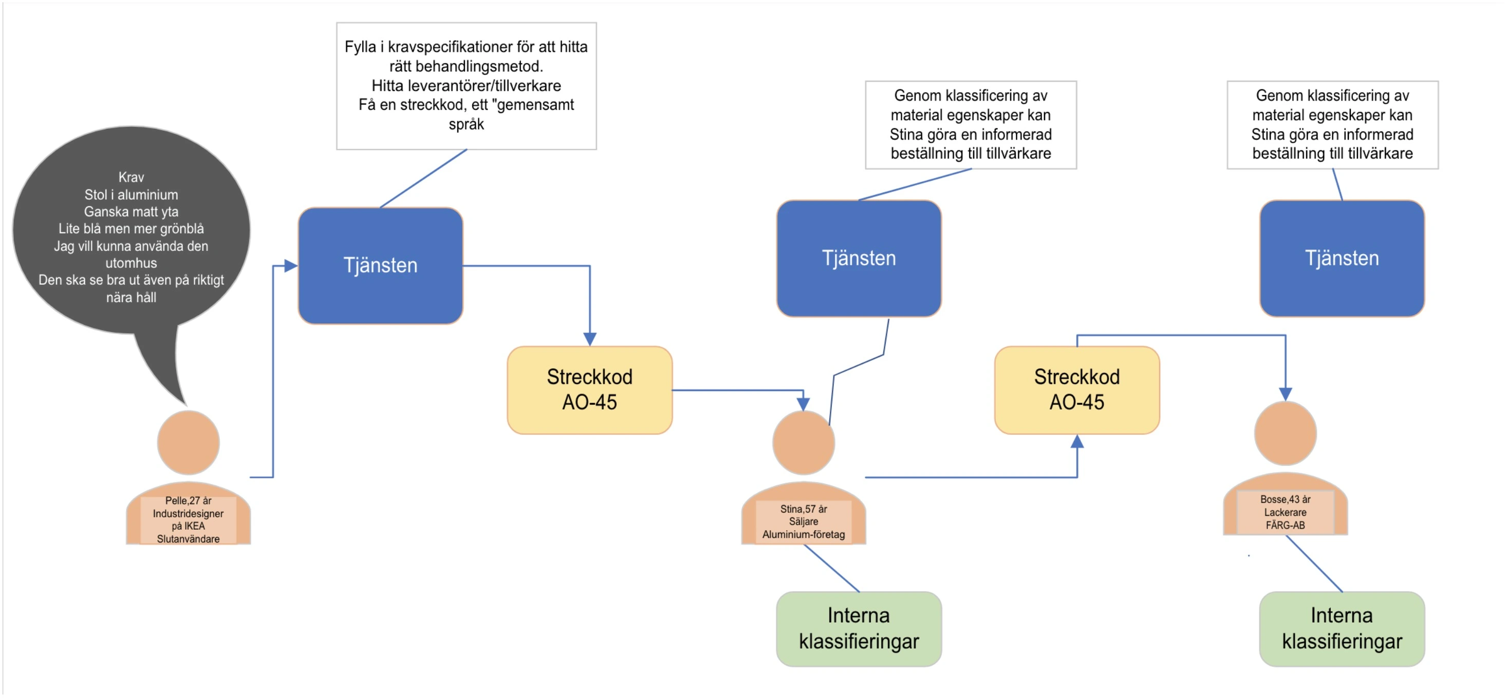
use case scenario
To understand what needed to be done, we decided early on to create a simple conceptual interaction with the service. Without defining the features or practical interactions with the app, we wanted to understand the desired outcome. The use case scenario was shown to the project owner and some stakeholders during user tests, to make sure our vision aligned with what they wanted.
stakeholder interviews
We conducted several interviews with different actors within the production chain. All of them agreed
that there is a lack of communication. The interviews also showed us that the problems not only arise
between the seller and buyer, but also within different actors in the chain. As an example, the
temperature with which someone brings the aluminum to during shaping will have an effect on the
paintjob. Since the shaper and painter usually work in different factories, they often don’t
communicate these things. The interviews also showed that shipment is a large part of the issues that
arise, since packing will have an effect on damages and cost.
Follow-up interviews were conducted to make sure we were going in the right direction. WIreframes and
storyboards were used to illustrate potential uses and interactions. Stakeholder opinions were written
down and helped us iterate the design further.
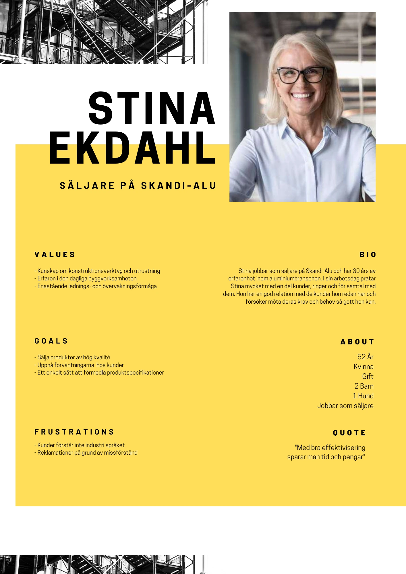
personas
Persona hypotheses were initially created based on desktop research. These were refined after stakeholder interviews to better represent the target users' needs and goals. The personas helped the team understand the different perspectives within the industry and guided the design process.
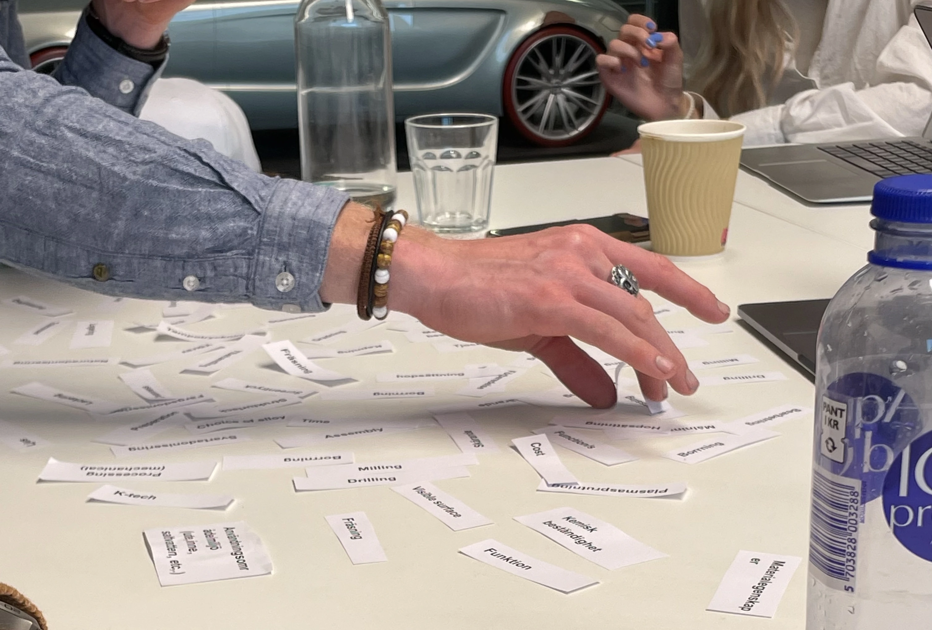
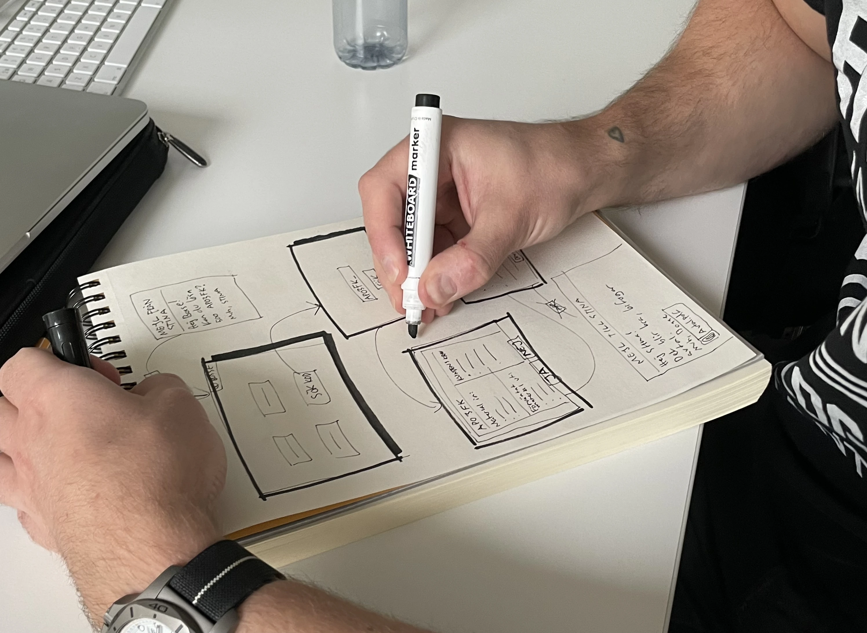
concept sketching
We created concept sketches to visualize ideas and iterate on potential designs. Sketching helped us
quickly explore different layouts and interactions, refining our concepts based on feedback.
Concept sketches were shared within the team for discussion, allowing us to identify strengths and
weaknesses in each idea. This collaborative process ensured we considered diverse perspectives and
refined concepts iteratively.
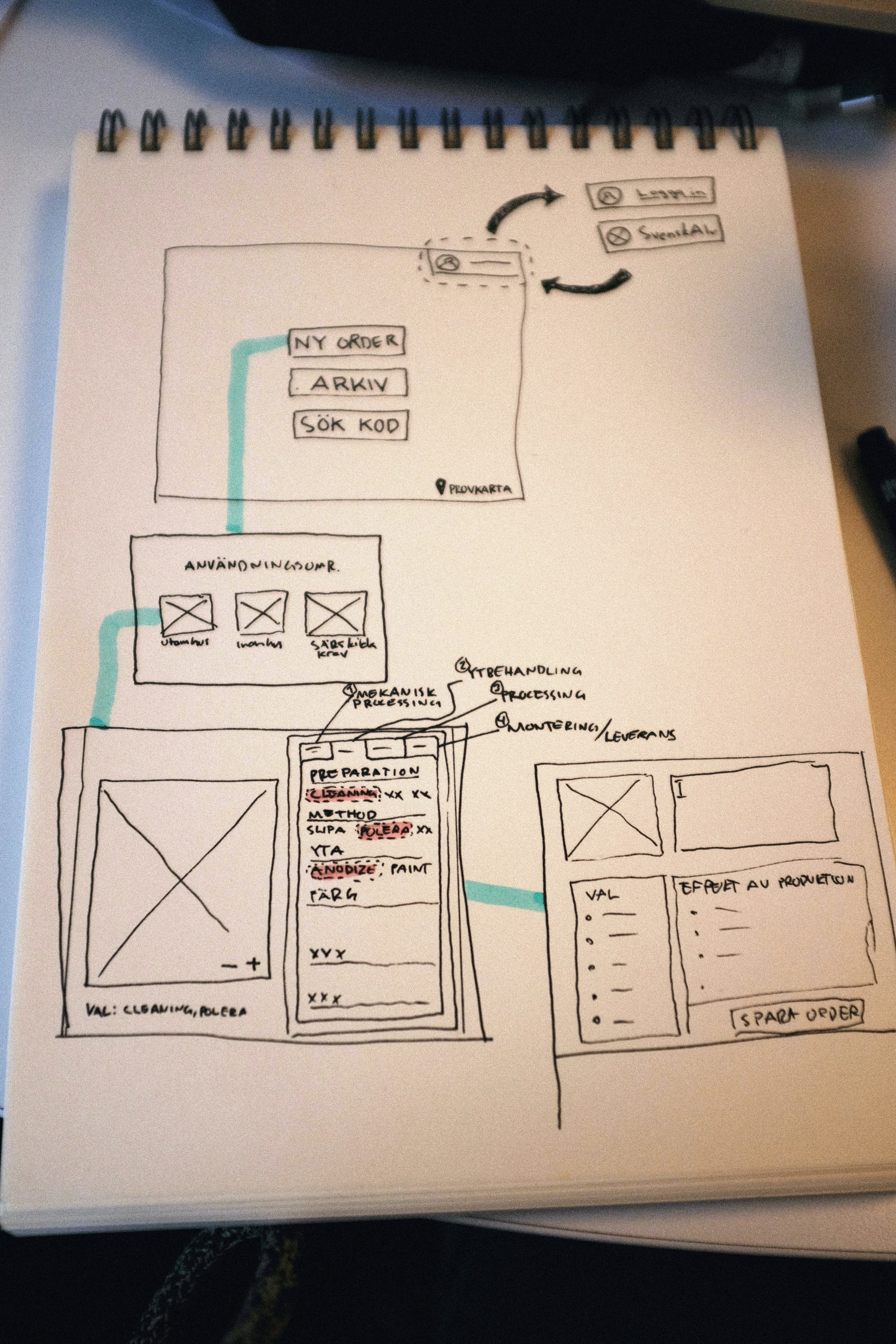
wireframing and prototyping
We developed wireframes to outline the structure and layout of the service. Wireframes provided a
clear blueprint for the design, allowing us to plan the placement of features and elements
effectively.
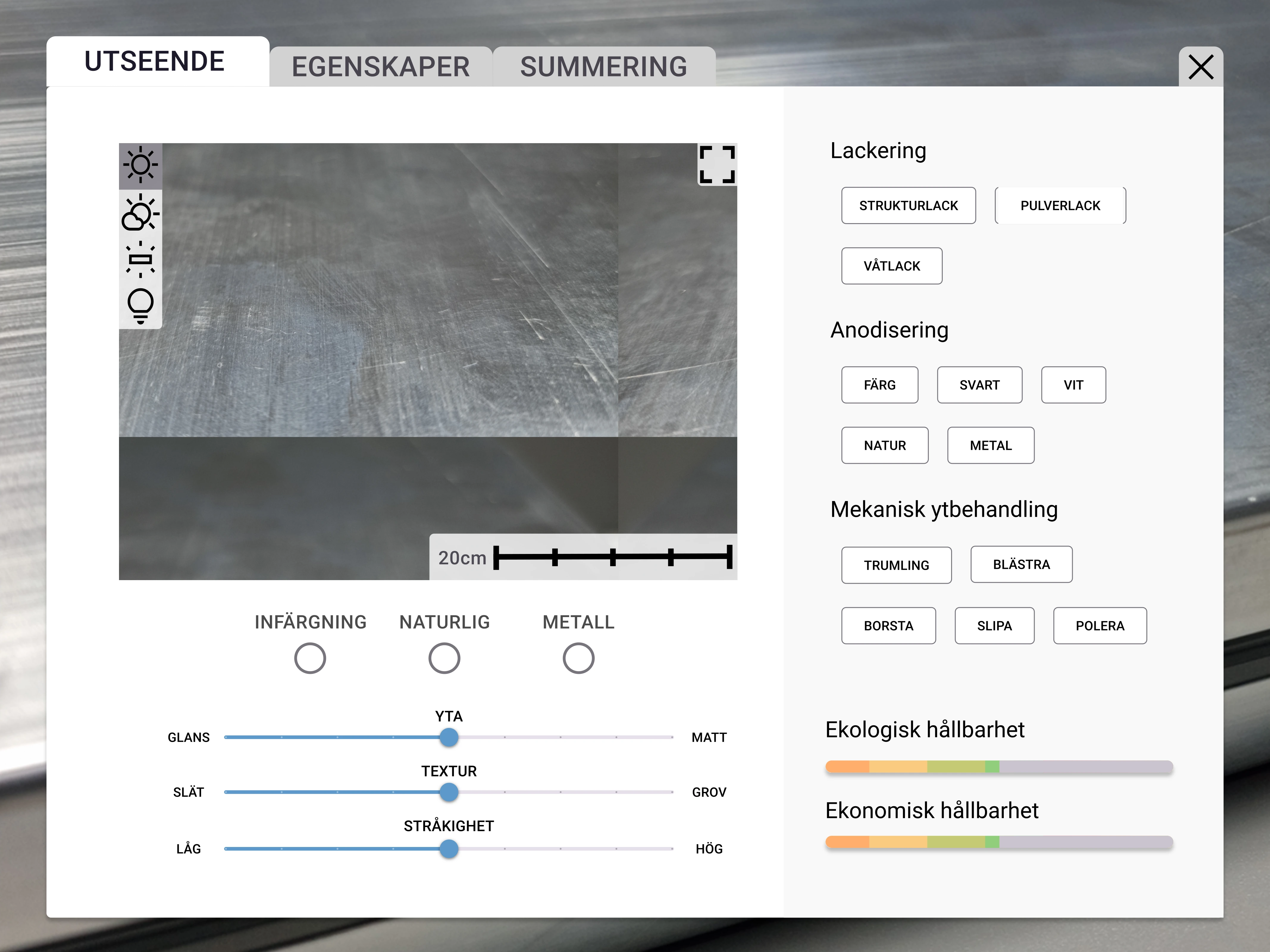
Using Figma, we created a high-fidelity prototype with interactive elements. This prototype allowed us
to test the service with users, gathering feedback on usability and functionality.
We evaluated the service against user needs and goals, ensuring it addressed key areas effectively.
Feedback from user testing guided our refinements, focusing on enhancing usability and functionality.
We used tools like heuristic evaluation and cognitive walkthroughs to assess the design from different
perspectives, identifying potential improvements.
final design
Upon project completion, we presented an interactive prototype to multiple stakeholders involved in
the project. This prototype, rooted in insights obtained from our research, served as the initial step
toward a finalized, fully integrated product. Additionally, we offered the project owners
recommendations for ongoing development, encompassing suggested research areas and necessary design
decisions. A report describing the entire process, insights included, was also provided to the project
owners.
Check
it out.
takeaways
The value of user insight. As we were navigation within a field that we knew nothing about, it was the
insights gathered from stakeholders that made the project possible. Having the expertise of
stakeholder enabled us to focus on what we were good at, which is UX design. An added bonus was that
the stakeholders became more interested in and excited about the project because they were now a big
part of the design process, rather than just being project owners.
Agile work was a huge part of this process. I learned to be relaxed and adaptive to change and not
worry too much about the process set up in the beginning. Responding to change and modifying the plan,
rather than strictly following a pre-set plan, proved to be a great ability for this project. I will
keep this in mind for further projects as well.
04. Core Launcher
introduction
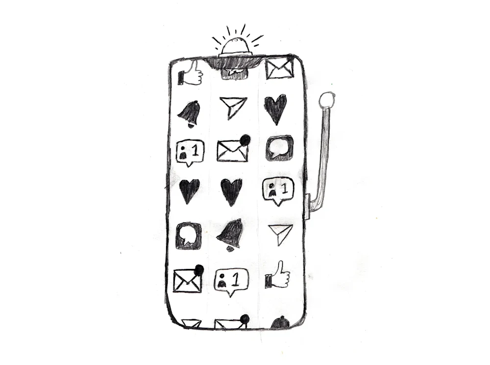
As an Android user and designer, one of my favorite features is the ability to customize every aspect of my phone. One of the most impactful customizations is the use of a custom launcher. Acting as the phone’s home screen, the launcher is what you return to when you press “home.” It’s where you place your widgets and, more importantly, access your apps.
If you're like me, it's also a place where you often find yourself mindlessly browsing, looking for something to entertain you—often opening attention-grabbing apps out of habit. Their colorful icons stick out, drawing you in like a moth to a flame. There’s another problem: most launchers are designed for everyone. This results in interfaces full of features many users don’t need, creating clutter both visually and functionally.
As a fun side project—and a way to explore Android and Kotlin development while pushing customization to the next level—I decided to create my own niche launcher. What started as a learning experience turned into a fully-fledged, production-ready application that’s now steadily growing on the Google Play Store.
CoreLauncher is a custom-built Android launcher focused on performance, digital minimalism, and psychological well-being. Unlike traditional launchers that overwhelm users with visual noise and unrestricted app access, CoreLauncher is designed to restore intentionality and reduce distractions. Built from the ground up in Kotlin, it's optimized for speed, simplicity, and self-control.
understanding the problem
Most Android launchers are built for convenience, offering endless customization, widgets, and a full app drawer. While helpful on the surface, these features often lead to digital overuse and distraction. The lack of friction between impulse and action makes it far too easy to launch distracting apps without a second thought.
CoreLauncher challenges this paradigm by introducing subtle resistance—just enough to prompt reflection before engaging with an app.
the vision and goals
The main goal behind CoreLauncher was to help users regain control of their digital habits. This required reimagining what a launcher could be—not just a utility, but a mindful interface.
The objectives were clear:
- Reduce screen time
- Encourage intentional app usage
- Optimize performance
- Strip away unnecessary complexity
rethinking ux through psychology
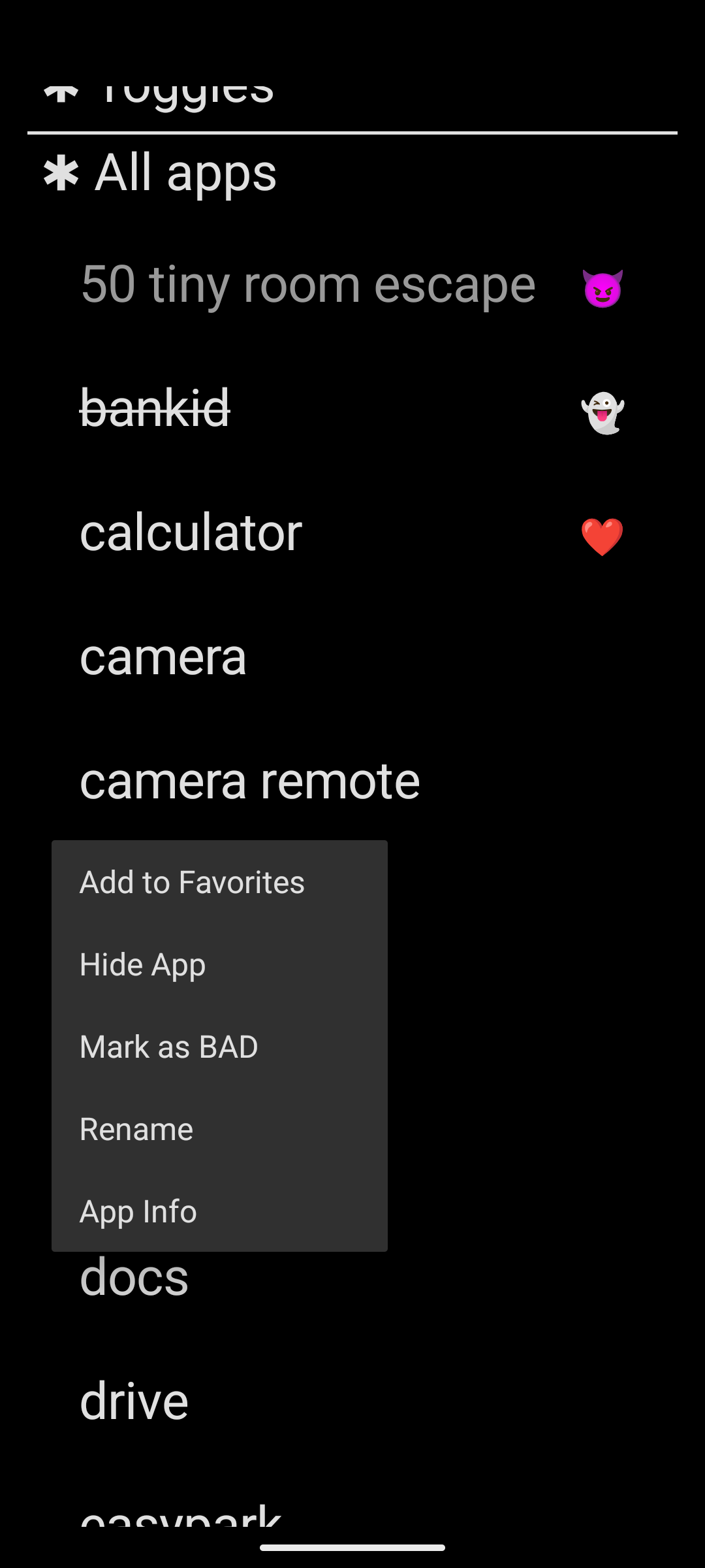
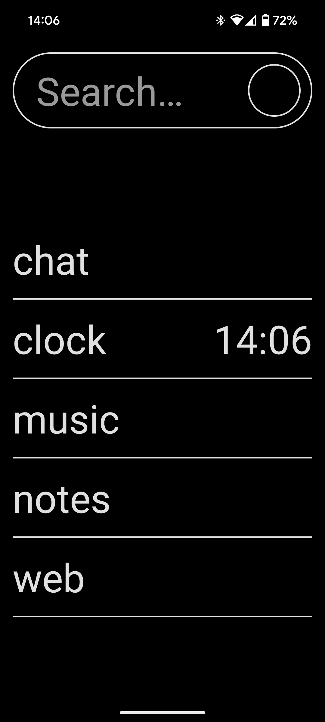
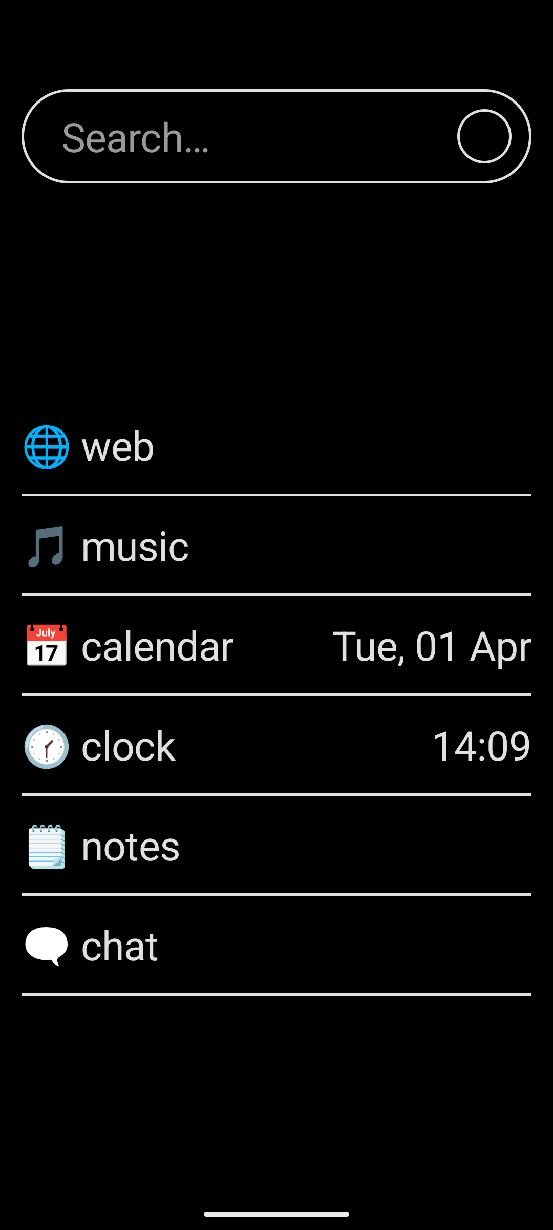
CoreLauncher’s design is deeply rooted in behavioral psychology. One of its core features is the removal of the traditional app drawer. Instead, users can mark a few essential apps—like Camera, Phone, or Messaging—as favorites. To access any other app, users must manually search for it. There is no browsable app list, reinforcing intentional access and eliminating the temptation to scroll mindlessly.
To further support habit-breaking, the launcher includes a “bad app” feature. Apps flagged as distracting don’t open immediately. Instead, pressing and holding one initiates a seven-second countdown. This creates a brief pause, giving the user a chance to reconsider. This moment of friction helps disrupt automatic behavior patterns and encourages more mindful use.
Visually, the design is just as intentional. CoreLauncher avoids wallpapers, widgets, and animations. The UI is stark and monochrome, reducing visual clutter and cognitive load.
a look under the hood
CoreLauncher is written in Kotlin with a focus on clean, efficient architecture. The timer feature is powered by Kotlin coroutines, which allow for asynchronous delays that can be easily canceled if the user exits midway.
App-specific settings—like font preferences, timer durations, and popup acknowledgments—are saved using SharedPreferences for lightweight, persistent storage.
The app launch process uses Android’s intent system, allowing CoreLauncher to intercept launches and apply timers when necessary. The home screen shows only user-pinned apps, reinforcing curated access.
Internally, each app is categorized using enums: NEITHER (default), BAD, or FAVORITE. The app list is cached to avoid querying the system on every launch, greatly improving performance.
CoreLauncher prioritizes efficiency. The home screen uses a RecyclerView with asynchronous diffing for smooth rendering. The layout hierarchy is shallow, and no heavy libraries are used—keeping the app responsive even on low-end devices.
overcoming challenges
Building a custom launcher meant navigating Android’s complex intent and permission systems from scratch. One key concern was preventing users from accidentally locking themselves out of vital apps. Implementing in-app purchases also required a robust, secure approach that wouldn’t compromise the minimalist ethos.
Striking the right balance between helpful friction and frustrating delay took multiple iterations, including beta testing and user feedback.
outcomes and feedback
User feedback has been overwhelmingly positive. Many report feeling more mindful and intentional with their phone use. The bad app timer, in particular, has helped users break automatic scrolling habits. CoreLauncher has proven stable under pressure, with no significant crashes or performance issues reported. It maintains a low memory and CPU footprint, making it ideal even for older devices.
visuals and interface

conclusion
What started as a weekend project grew into something much more impactful. While researching features and exploring the market, I discovered a real need for this kind of launcher. The timer for distracting apps alone has dramatically reduced my own screen time, and it’s been really cool to hear similar stories from users around the world.
CoreLauncher is more than just another launcher—it’s a statement against digital clutter and unconscious usage. By combining behavioral insight with technical simplicity, it offers a meaningful alternative for anyone seeking to reclaim their attention.
Future updates will explore features like scheduled app blocking, productivity tracking, focus modes, and optional usage analytics to help users stay on track.
Check it out on the Play Store.